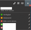
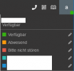
aha, changed colors
v20u5
View attachment 47459
v20u6alpha
View attachment 47460
The problem could be: it's difficult to explain custom status to customers, especially since you've always been able to change the name.
Since the names of the other three status have also changed in recent years, understanding of them is limited and there are also different ways to describe the same thing in different languages (in the last few years: Nicht stören, Bitte nicht stören, DND, Out of Office, OoO ... - among others, plus the many different ways to express business and non-business hours and their automatic status changes).
We often describe things to customers using colors or create color coded instructions as the only constant over the last 10 years.
They're not stupid. We and our customers can read and understand simple text instructions; we're in Europe. But the changes of the last few years force us to do so.
On top of that, a significant proportion are men. How are we supposed to explain the colors to them? Until now it was easy: green, orange, red, light green and pink. Now instead we're seeing something like turquoise / cyan-blue (2FBBB3) and something like darker cyan-blue (1D8FD2) ...
Some of these people aren't exactly young anymore, either - included me.
This makes the difference even more difficult to explain.
These / our instructions therefore are all obsolete. We have to create all these instructions again: descriptions, screenshots, colors. Not nice.
And actually, I'm not talking about changes in the last 10 years but the last two – where the names often went back and forth. Now the colors, too


 . I haven't tried it all yet.