Unhide voicemail and settings button

Status
Not open for further replies.

qbitnetworking

Bronze Partner
Joined
Nov 28, 2020
Messages
138
Reaction score
30
Hi 3CX Team, can I request one small change to the desktop app? Can you make it so the Voicemail and Settings buttons aren't hidden in a separate (...) menu? I've gotten a lot of calls from users asking how to listen to their voicemails with this app because they can't find that button. It doesn't make a lot of sense that it's not on the side with the rest of those buttons as there appears to be plenty of room for them not to mention it hides the blue notification bubble.

Thanks,
Jeremy
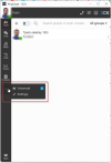
2023-01-07 21_05_19-Video Conferencing integrated with 3CX •• Guidelines _ 3CX - Brave.png

 
Honestly, this has been asked a hundred times already.

It is not customizable and will not be changed.

The three dots become blue when there are voicemails, that's it. Enable email notifications to let them know they have any.
 
Honestly, this has been asked a hundred times already.

It is not customizable and will not be changed.

The three dots become blue when there are voicemails, that's it. Enable email notifications to let them know they have any.
I understand it's not customizable but why would they refuse to change this?
 
One of those threads is going to be 5 years old. 5 years and they still haven’t addressed such a simple and obvious UI change. Who knows? Maybe they just don’t have anyone there that can do it.
 
Yup. Voicemail is used all the time. It's just terribly poor design to hide it under the elipses icon. If it is because the word "voicemail" is too long to fit neatly in the menu consider with the current font/size choice, then just called it "VM" and put it in the main menu. Everyone knows what VM means and will know when they click it and see teh headong on that page.
 
Yup. Voicemail is used all the time. It's just terribly poor design to hide it under the elipses icon. If it is because the word "voicemail" is too long to fit neatly in the menu consider with the current font/size choice, then just called it "VM" and put it in the main menu. Everyone knows what VM means and will know when they click it and see teh headong on that page.
It's got to be intentional because there is clearly enough room for it.

Bizarre either way.
 
Is this better in v20 ?
 
What's the deal with that 3CX ? Why can't those be more accessible ?
 
We need that 'basic' phone system menu on the screen, please.
 
Status
Not open for further replies.