


Guillaume Bourgeois
Advanced Certified
- Joined
- Aug 20, 2019
- Messages
- 1,150
- Reaction score
- 1,290
…
First, with you, things went well. People are so resistant to change, it’s crazy.
Regarding the web client, I really like the new layout they introduced for the call forwarding menu (profile management). It feels much more user friendly in my opinion.
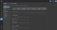
On the flip side, I’m less fond of the web dialer’s visual design. The default display of recent numbers directly on the dial pad throws me off, though it’s probably just because I wasn’t expecting it.
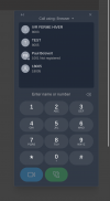
No offense to the designers, but it feels more like a calculator interface, with round number buttons and a framed display area.
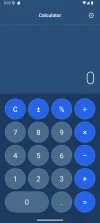
I preferred the previous dialer, but the new theme isn’t dysfunctional. I just need a bit of time to get used to it.
…
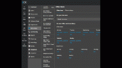
I agree that the width of the left-hand menu could be slightly reduced without affecting its content scaling, to free up some space on interactive pages, though the overall impact would be minimal.
—
It is a bit like a man who is not particularly old, but already rich in « wisdom and experience », deciding to dye his hair for a touch of youth.
@N_G


(Edit: On second thought, I am not entirely sure this is the best way to make my return to the forum. … …. I think I’ll go hide now !
  )
)
Terrible is a bit harsh, its not that much different.. the new lick of paint looks very nice - stick it in dark mode and its easier on the eyes.
First, with you, things went well. People are so resistant to change, it’s crazy.
Regarding the web client, I really like the new layout they introduced for the call forwarding menu (profile management). It feels much more user friendly in my opinion.
On the flip side, I’m less fond of the web dialer’s visual design. The default display of recent numbers directly on the dial pad throws me off, though it’s probably just because I wasn’t expecting it.
No offense to the designers, but it feels more like a calculator interface, with round number buttons and a framed display area.
I preferred the previous dialer, but the new theme isn’t dysfunctional. I just need a bit of time to get used to it.
…
I agree that the width of the left-hand menu could be slightly reduced without affecting its content scaling, to free up some space on interactive pages, though the overall impact would be minimal.
—
It is a bit like a man who is not particularly old, but already rich in « wisdom and experience », deciding to dye his hair for a touch of youth.
@N_G
(Edit: On second thought, I am not entirely sure this is the best way to make my return to the forum.
… …. I think I’ll go hide now ! )





 )
)


