


- Joined
- Nov 23, 2020
- Messages
- 30
- Reaction score
- 16
these buttons here, it is not clear what is each button for?
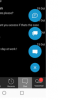
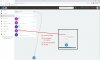
A few ideas:
(1) use the same icons in all locations
(2) Use Text and color to identify options better (especially as communication options expand (Facebook, Whats app, etc, etc).
(3) move add chat / SMS to top.
The (+) looks especially awkward on my Portrait monitor.

(You can see the little blue dot in the bottom right).


