- Joined
- Aug 3, 2018
- Messages
- 3
- Reaction score
- 2
I noticed a change in the latest Windows Desktop App Beta that seems inconsistent with the stable release.
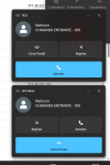
In the stable version, the incoming call popup shows the buttons in this order:
In the latest Beta version, the layout has changed and the button positions appear to be swapped:
This change is causing some confusion because users are accustomed to the previous layout and may accidentally press the wrong button when answering incoming calls. For call center and reception users, muscle memory is important and unexpected UI changes can negatively impact usability.
Is this change intentional?
In the stable version, the incoming call popup shows the buttons in this order:
- Mailbox
- Reject
- Answer (large blue button at the bottom)
In the latest Beta version, the layout has changed and the button positions appear to be swapped:
- Reject
- Answer
- Mailbox (large blue button at the bottom)
This change is causing some confusion because users are accustomed to the previous layout and may accidentally press the wrong button when answering incoming calls. For call center and reception users, muscle memory is important and unexpected UI changes can negatively impact usability.
Is this change intentional?